Config Reference
Props
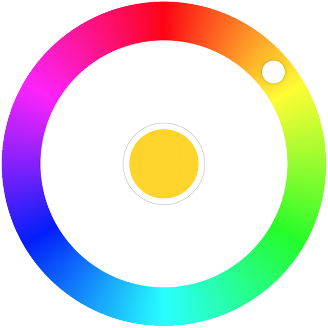
hue
- Type:
Number - Default:
0
A number between 0-359. Around 0º/360º are reds. 120º is where greens are and 240º are blues.
saturation
- Type:
Number - Default:
100 - Optional
A number between 0-100. The larger the percentage, the more "colorful" this color is. 0% is completely desaturated (grayscale). 100% is fully saturated (full color).
luminosity
- Type:
Number - Default:
50 - Optional
A number between 0-100. 0% is completely dark (black). 100% is completely light (white). 50% is average lightness.
alpha
- Type:
Number - Default:
1 - Optional
A number between 0-1. Opacity/Transparency value. 0 is fully transparent. 1 is fully opaque. 0.5 is 50% transparent.
disabled
- Type:
Boolean - Default:
false - Optional
A boolean to disable UI interactions. When :disabled="true" is used the color picker is rendered with a dimmer color to indicate that the field is not available for use.
step
- Type:
Number - Default:
1 - Optional
Amount of degrees to rotate the picker with keyboard and/or wheel.
variant
- Type:
String - Default:
collapsible - Optional
The mode of the picker. By default it will close/open when the color well is clicked. Use variant="persistent" to prevent collapsing/closing and to keep the widget always open.
initially-collapsed
- Type:
Boolean - Default:
false - Optional
Hides the palette initially. Using variant="persistent" and :initially-collapsed="true" at the same time is not supported.
mouse-scroll
- Type:
Boolean - Default:
false - Optional
Use wheel (scroll) event to rotate. By default it's off to keep things simple. Add :mouse-scroll="true" to allow the user to change the color by scrolling with mouse/trackpad.
Here be dragons!
Keep in mind that by turning the scroll to rotate functionality on it may result in actually worse UX than without it (preventing page scroll while mouse pointer is over the picker). It's also another non-passive event listener that could potentially introduce jank on scroll.
aria-label
- Type:
String - Default:
color picker - Optional
Defines a string value that labels the color picker. It provides the user with a recognizable name of the object.
TIP
When a user interface is translated into multiple languages, ensure that aria-label values are translated.
aria-roledescription
- Type:
String - Default:
radial slider - Optional
Defines a human-readable, author-localized description for the role of the color picker. Users of assistive technologies depend on the presentation of the role name, such as "slider" for an understanding of the purpose of the element and, if it is a widget, how to interact with it.
TIP
When a user interface is translated into multiple languages, ensure that aria-roledescription values are translated.
aria-valuetext
- Type:
String - Default:
'red' | 'yellow' | 'green' | 'cyan' | 'blue' | 'magenta' - Optional
Defines the human readable text alternative of the value for a range widget. You can bring your own color-name map if you want (e.g. "dark orange", "amber", "salmon")
TIP
Make sure you update the aria-valuetext with any color change and as other aria attributes, when a user interface is translated into multiple languages, ensure that aria-valuetext values are translated.
aria-label-color-well
- Type:
String - Default:
color well - Optional
Defines a string value that labels the color well (middle selector).
TIP
When a user interface is translated into multiple languages, ensure that aria-label-color-well values are translated.
Events
input
- Type:
Function - Params:
hue(Number)
Emitted every time the color updates. This could be a touchstart/mousedown event, when rotating the knob, keyboard shortcuts like ↑, and scrolling if enabled. It's also the glue between the color picker component and the outside world. Use this to update the hue prop.
<template>
    <ColorPicker :hue="hue" @input="updateColor" />
</template>

<script>
    import { ref } from 'vue';

    export default {
        name: 'example-basic',
        setup() {
            const hue = ref(50);

            return {
                hue,
                updateColor(value) {
                    hue.value = value;
                },
            };
        },
    };
</script>
change
- Type:
Function - Params:
hue(Number) - Optional
Emitted every time the color changes, but unlike @input this is not emitted while rotating the knob. @change is a less noisy version of @input which is useful if you want to react to knob rotation stop for example or to use the <ColorPicker> as an uncontrolled component.
select
- Type:
Function - Params:
hue(Number) - Optional
Emitted when the user dismisses the color picker (i.e. interacting with the middle color well). Can be used as a secondary confirmation step from the user that this is the color value to be saved for example.
<template>
    <ColorPicker :hue="hue" @input="onInput" @select="onSelect" />
</template>

<script>
    import { ref } from 'vue';

    export default {
        setup() {
            const hue = ref(50);

            return {
                hue,
                onInput(value) { hue.value = value; },
                onSelect(value) {
                    console.log('Color picker was dismissed.', hue);
                },
            };
        },
    };
</script>